overview
ABOUT THE PROJECT
I designed a mobile responsive website for NOMADgardens, San Francisco's first 'roaming' garden. The design process included business strategy, identifying the intended target market and content strategy based on user flows from sign-up to renewal.
FOCUS: Content Strategy, Information Architecture, Low and Hi-Fidelity Wireframing, Graphic Design
TIMELINE: 6 weeks
WEBSITE TEAM: Stephanie Goodson, Wendy White, Debie Feling
DELIVERABLE: New Responsive Website (link here)
the problem
The website's target audience had shifted from a campaign to support the launch of a community garden in an interim use vacant lot, to new gardeners that would be signing up to use the newly launched community garden. The lack of clarity was resulting in a loss of customers from the non-profits number one revenue stream, new gardeners.
CONSTRAINTS: Time and budget
DESIGN PROCESS
1. Business Model
2. User Research
2. Content Requirements
3. Information Architecture
4. Interaction Design
5. Information Design
BUSINESS NEEDS
The community garden currently sits on a vacant lot in the growing Mission Bay, San Francisco neighborhood. The interim use agreement between the land developer and the garden was in its second year. In order to show the developer the value it was bringing to the community, the garden needed to show a demand for gardening by doubling the number of gardeners. Understanding this new goal, new gardeners were identified as the target market of the new website, with a close second donors.
USER NEEDS
Current gardeners were surveyed to understand the behaviors, pain points and marketing channels.
Questions: How did you hear about NOMADgardens? What made you decide to look for a community garden? How would you want to hear about gardening opportunities in your neighborhood?
Results: 80% of our gardeners were first time gardeners, 48% male and 52% female, were experts at trying new things, loved to be outside, were on nextdoor and searched for outdoor lifestyle activities on Google.
PERSONA
Our persona Ann was created to keep our voice and content on target with attracting our key user.
HEURISTIC EVALUATION
I conducted a heuristic evaluation of the current website, role playing as Ann, a new Mission Bay resident who was looking for ways to be in nature and add to her already healthy lifestyle. The evaluation provided insight on what information she was looking for and what tasks she wanted to be able to perform with the website.
CONTENT REQUIREMENTS
Sample Flow: Become a Gardener
I created a user flow to identify Ann's "happy path" from arriving at the website, to signing up as a gardener, to growing her own food. Beginning with this path helped articulate the simplest actions Ann would take from start to finish. Task flows were then created from each action item (blue buttons), keeping me focused on simple navigation and signing up new gardeners.
Sample Flow: Membership Renewal
The design of the new website came during the one year anniversary of the garden. A renewal process therefore needed to be created and integrated into the company's new website. I designed a flow chart that would easily navigate the user from membership to renewal as well as ways to provide feedback, should the user decide not to renew.
Wireframing
INFORMATION ARCHITECTURE + INTERACTION DESIGN
Built on a 960 grid system, the new website was designed as a responsive site with three breakpoints. Desktop canvas size was 1224px with the content area kept at 980px.
BREAKPOINTS:
- 400px - 484px
- 485px - 799px
- 800px - 1224
NAVIGATION
A card sort and whiteboard exercise helped identify the critical pages required for navigation. Wireframes were created to identify the location of utility menu elements (newsletter, social icons and DONATE button) and main navigation elements (pages + shopping cart). Two types of page layouts were defined (image + text header) to distinguish between a "call to action page" versus a "follow up action" page, which can be seen in numbers 3 and 4 below.
INFORMATION DESIGN
The goals of the website were established, outlining the hierarchical requirements used to wireframe page layouts and strategize page content.
- Become a gardener
- Define NOMADgardens
- Solicit donations
- Highlight key community members
CONTENT STRATEGY
VISUAL DESIGN
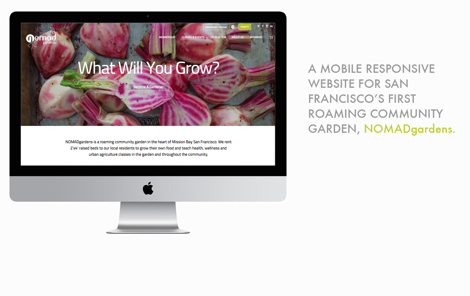
To make it clear that NOMADgardens is a community garden, the home page highlights a call to action as soon as the user arrives to the site. The slogan "What Will You Grow?" with beautiful rotating images (by food stylist/writer Jenny Park) captured the aesthetic and style of what the users want to grow.
GRAPHIC DESIGN
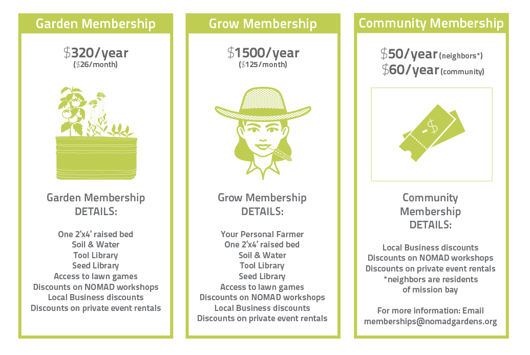
MEMBERSHIPS: It was important to outline membership options and the steps to becoming a gardener. We created graphics to describe each membership option and a sub-menu giving each membership its own page. This clarified the distinction and path to payment.
USER JOURNEY
THREE STEPS: We designed the content voice to be playful, educational and community-oriented. We chose soft colors to reflect calm and respite to evoke the way the garden will make users feel when they become members. Graphics are cartoon whimsical and elicit childlike curiosity to life, key qualities discovered during our user research.
PURCHASE
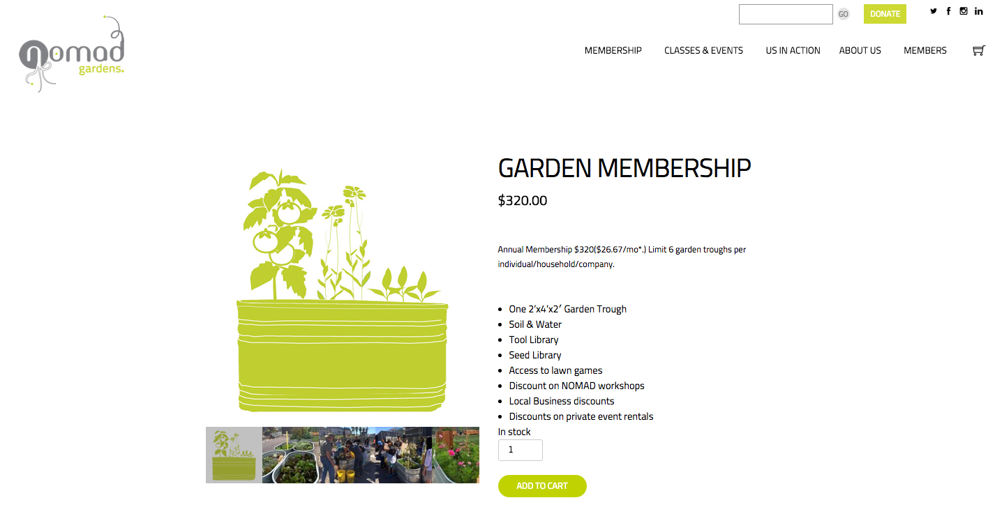
WHAT YOU GET: The previous website did not clearly articulate what the $320/year membership cost included. The new design incorporated an e-commerce page with pictures, a detailed description and a way to add to cart.
mobile ready
MOBILE SCREENS
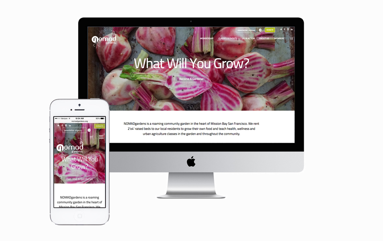
Many of the users found out about the garden by walking by. The new website therefore needed to allow new users to easily pay for membership. To improve screen real estate, we used a hamburger menu at breakpoint 800px. Graphic and text components were designed to link to ensure stacking when responding to a smaller screen.
Results
A NEW RESPONSIVE WEBSITE
The final deliverable was a responsive website that provided users an easy way to purchase a membership, renew subscriptions, review current events, purchase event tickets and see upcoming events.
FINAL THOUGHTS
Clearly articulating the user was the most challenging component of designing this new responsive website due to NOMADgardens' hybrid business model, a non-profit with a product. More time needs to be spent on understanding the gardeners, how they want to utilize the website and how donors (foundations and individual donors) respond to the new look.
NEXT STEPS
We continue to test the website with current gardeners to solicit feedback on content, membership selection, event announcements/registration, check out process, forum and renewal process.


